 Average Life Expectancy versus Cost of Healthcare World Average – INFOGRAPHIC
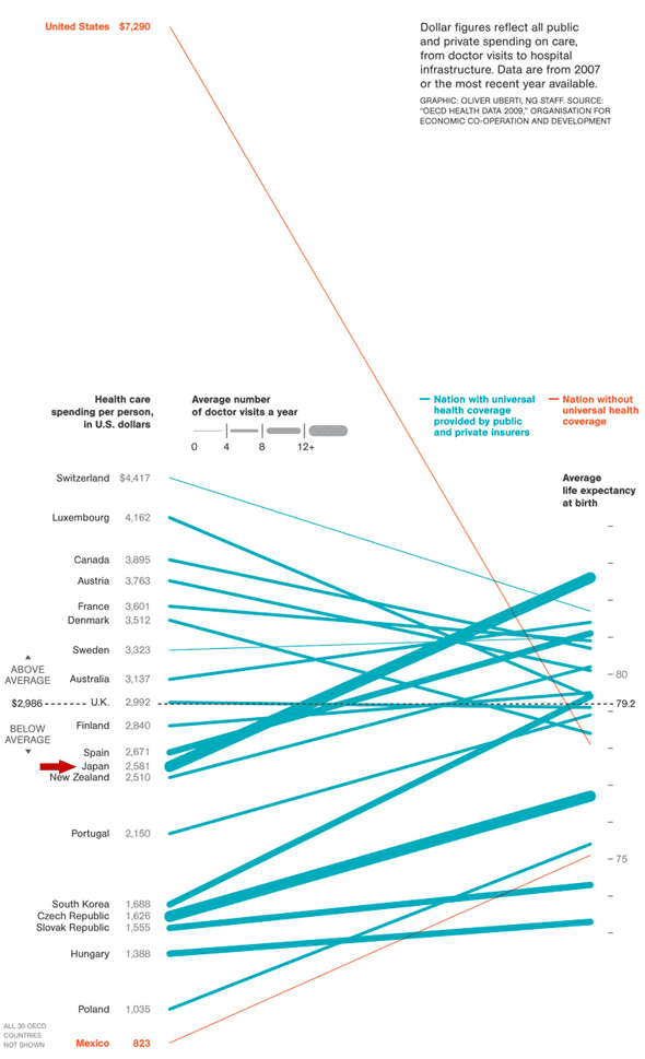
I love infographics when they actually add impact to a statistical disparity. Here is one originally published by National Geographic in 2009 showing three things.
- The average annual cost of healthcare per person in countries around the world – left vertical axis
- The average life expectancy in those same countries – right vertical axis
- Whether or not the nation has national health insurance – the color of the line
The USA is a major outlier in two respects.
- We have far and away the highest annual healthcare costs in the world
- The USA and Mexico are the only western democracies without national health insurance
And we are square in the middle of the pack with regards to life expectancy.
Here is the worldwide cost of healthcare vs. average life expectancy infographic.
[I apologize about image quality ... this is the best I could pull from the NatGeo site]

No matter where you stand in the healthcare debate – this average life expectancy vs. cost of healthcare infographic gives you a visual demonstration of how far outside worldwide averages that the USA costs lie.
If you believe that life expectancy has any connection at all with the quality of a nation’s healthcare system … you have to question whether we are getting our money’s worth.
Please put your thoughts/reactions in a Comment Below [thanks] …
Here is the original post containing the cost of healthcare average life expectancy infographic at the NatGeo website
========================

